


For Those Who Really Like Graphs and Maps
A website treasure trove of map and graph data all about the world: https://www.visualcapitalist.com/. Found this website after seeing the following Twitter thread referenced at ZeroHedge:

I decided to create a few more European population density renders - you can find more here if you need a break from the doomscrolling:
statsmapsnpix.com/2020/04/popula…


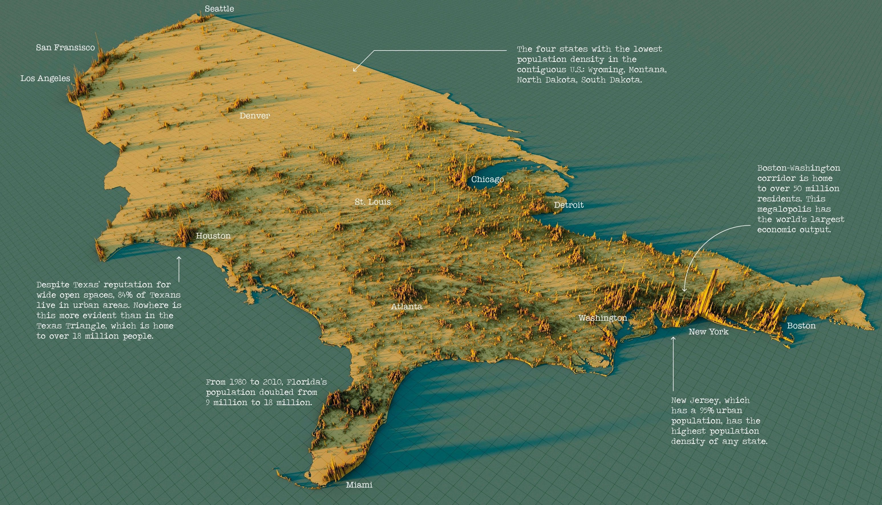
Below is a great example plot of high density human activity in the US; i.e., where things are the most noisy, chaotic, and confused in America. This is a very good representation of the locations of the biggest human 'fires' on the US portion of North America. Imagine where all the economic ‘makeup air’ fueling these big ‘fires’ flows from and to…
Wow, worth spending some time on this site. Many clever variations of expressing information normally found in classic graph formats. Thanks!